If you feel lost when trying to decide on a color palette for your house, you are not alone. On the surface, it seems like a simple enough task. Maybe you know what color you want but then learn of the myriad of shades. It is a daunting task and if you are paying for professionals to paint your space, it can get expensive fast. The last thing you want is to throw away money by having to redo the space when the colors don’t work for you.

Designers actually get this question a lot. Home and business owners everywhere want their space to flow. We put together a list of things we look at when creating a color palette for clients.
1. Functionality of the Room
We cannot stress this enough. The color of the space matters with what happens in that space. Adding drama is a great idea for intimate areas such as a master bedroom but not so much for a homeschool room.
2. Bordering Colors
The colors of the floor, trim, doors, fixtures, etc. can all influence the actual color the paint appears on the wall. For example, a gray may appear beige if it is in the flooring undertones. This is a common reason many end up disliking the color they picked after their visual comes together. The final color does not match the selected color. Designers are trained in understanding these color makeups and final outcome.
3. Add Depth
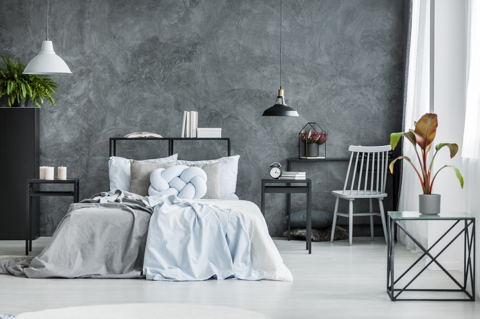
If you have a space you are looking to add depth in, you may want to consider some darker colors. I get it, you may be scared of turning your area into a dungeon. That absolutely can happen. I’ve toured houses that took a picture from Pinterest and copied it in an inappropriate space. But guys, this can be so beautiful when put in the right space. We recently updated a small library in a client’s house with a darker color to add that depth. It transformed the space and helped make the library actually appear larger.
4. Brighten the Space
When I updated my basement, I wanted to brighten the space. There just isn’t a lot of natural light flowing in and I did not want it to feel like a basement. I wanted a finished space to enjoy as a family. Not only did we paint the walls a bright color, we also painted the ceiling white. There are so many great ways to improve your space when you don’t get that natural sunlight.
5. Style of the Home
While there are color palettes that are flexible to use with many different styles, the style does matter. Our designers make sure that the overall transitions from exterior to interior and all rooms flow nicely. Let’s just get extreme for a moment. You have a farmhouse style exterior and walk in to see bright orange. Farmhouse styles typically use pastels and neutral color palettes so bright orange does not fit.
You may already know by now that picking a color palette is easier said than done for the untrained eye. This is why designers are often called to pick our color palettes. If you want to reduce your costs, you may want to consider calling a designer to help you out and help you avoid redoing reno work.
Want your home or business Beautifully Done? Contact us for a consultation and we will be happy to help!
Leave a comment here and tell us your thoughts about this post. Email emily@beautifullydone.design if there is something you would love to learn more about or if you have questions regarding the consultation process. Thank you for reading!


Comments